Introduction
The Waffle House Index has become an unexpected yet trusted barometer for storm severity across the Southeast. What began as a local observation has evolved into a widely referenced metric that helps communities and emergency officials gauge disaster impact.
What Happened
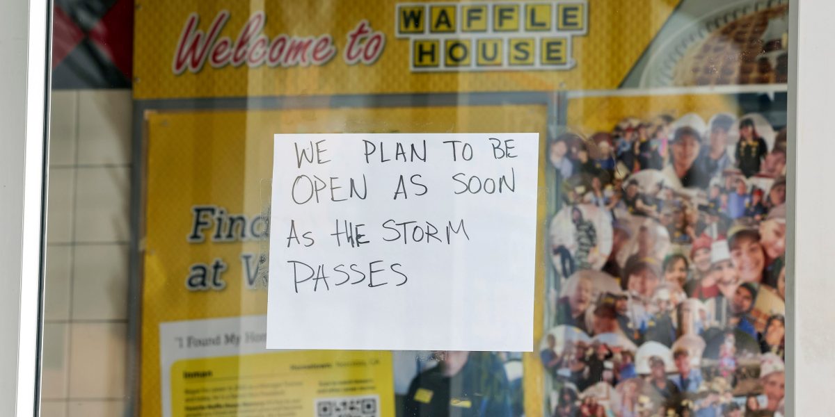
Former FEMA Administrator Craig Fugate conceived the index in 2004 after Hurricane Charley left him searching for food during damage assessment. With only a Waffle House serving a limited menu open, he noticed the restaurant's status reliably signaled the extent of surrounding devastation. His team soon mapped the chain's 1,900+ locations, creating a color-coded guide that linked restaurant operations to storm impact.
The index gained traction when Fugate joined FEMA under President Obama. During the 2011 Joplin tornado, both Waffle House locations remained open, reinforcing the metric's credibility. The chain's commitment to disaster readiness including generators, mobile command centers, and employee training turned a simple diner into a resilient community anchor.
Why This Matters
Green means full service, indicating minimal damage. Yellow signals limited menu and generator power, often without running water or electricity. Red means closure, pointing to severe destruction or unsafe conditions. These color cues help FEMA prioritize aid, direct resources, and inform evacuation decisions. For residents, a closed Waffle House often serves as an early warning that a storm's aftermath will be severe.
Beyond symbolism, the index reflects Waffle House's operational strategy. After Hurricane Katrina, the company invested heavily in disaster infrastructure, ensuring restaurants can stay open or reopen quickly even after direct hits.
Key Takeaways
- The Waffle House Index uses restaurant open/closed status to assess storm severity.
- Green indicates full service, yellow limited service, and red closure.
- FEMA and the public rely on the index for rapid damage assessment.
- Waffle House's disaster preparedness generators training mobile command makes the index possible.
- The metric originated with FEMA's Craig Fugate during Hurricane Charley in 2004.
Conclusion
From Hurricane Charley to modern storm tracking, the Waffle House Index proves that sometimes the most reliable metrics come from the unlikeliest places. Whether you're in a storm-prone state or just curious about disaster response, understanding this simple color-coded system offers valuable insight into community resilience and emergency preparedness.


Discussion
Join the conversation
Thoughtful reactions, questions, and follow-up ideas help shape the next story.